Client
Concept work
Duration
4 months
Year
2024
Tools used


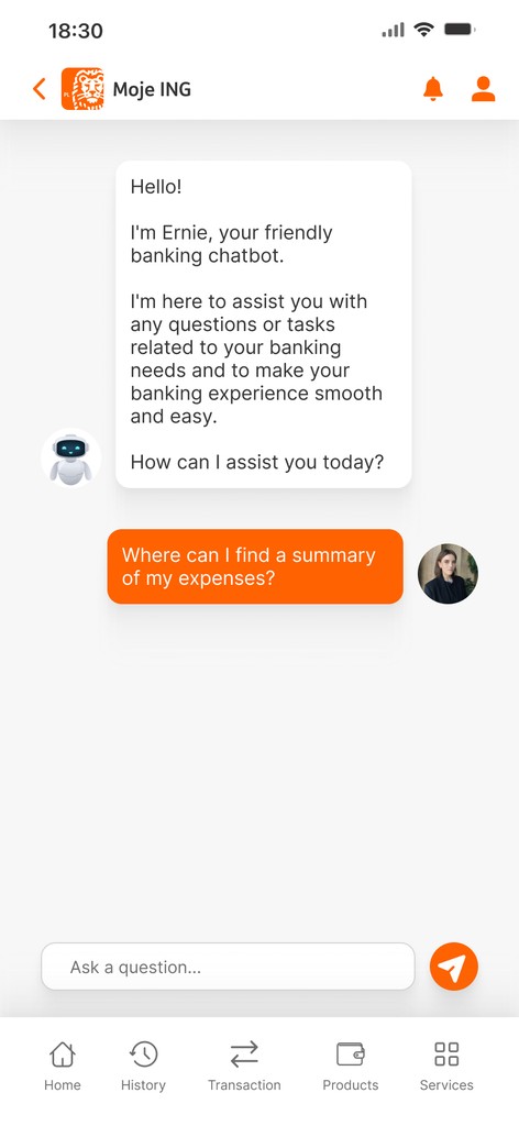
Research & Discovery 🔎
Market research: Analyzed competitor banking apps (mBank, Revolut, PEKAO, Alior Bank) industry trends, and customer expectations
Conducted in-depth interviews with 5 users
User research: Identified common pain points, usability issues, and customer feedback on the existing app
Ideation & Concept Development 💡
Generated new ideas to enhance user experience and improve banking workflows
Feature prioritization: Identified key improvements such as better navigation, transaction categorization
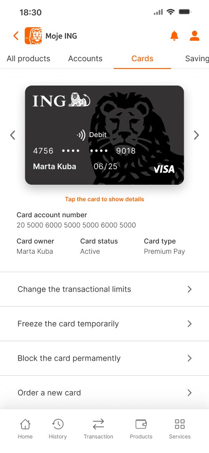
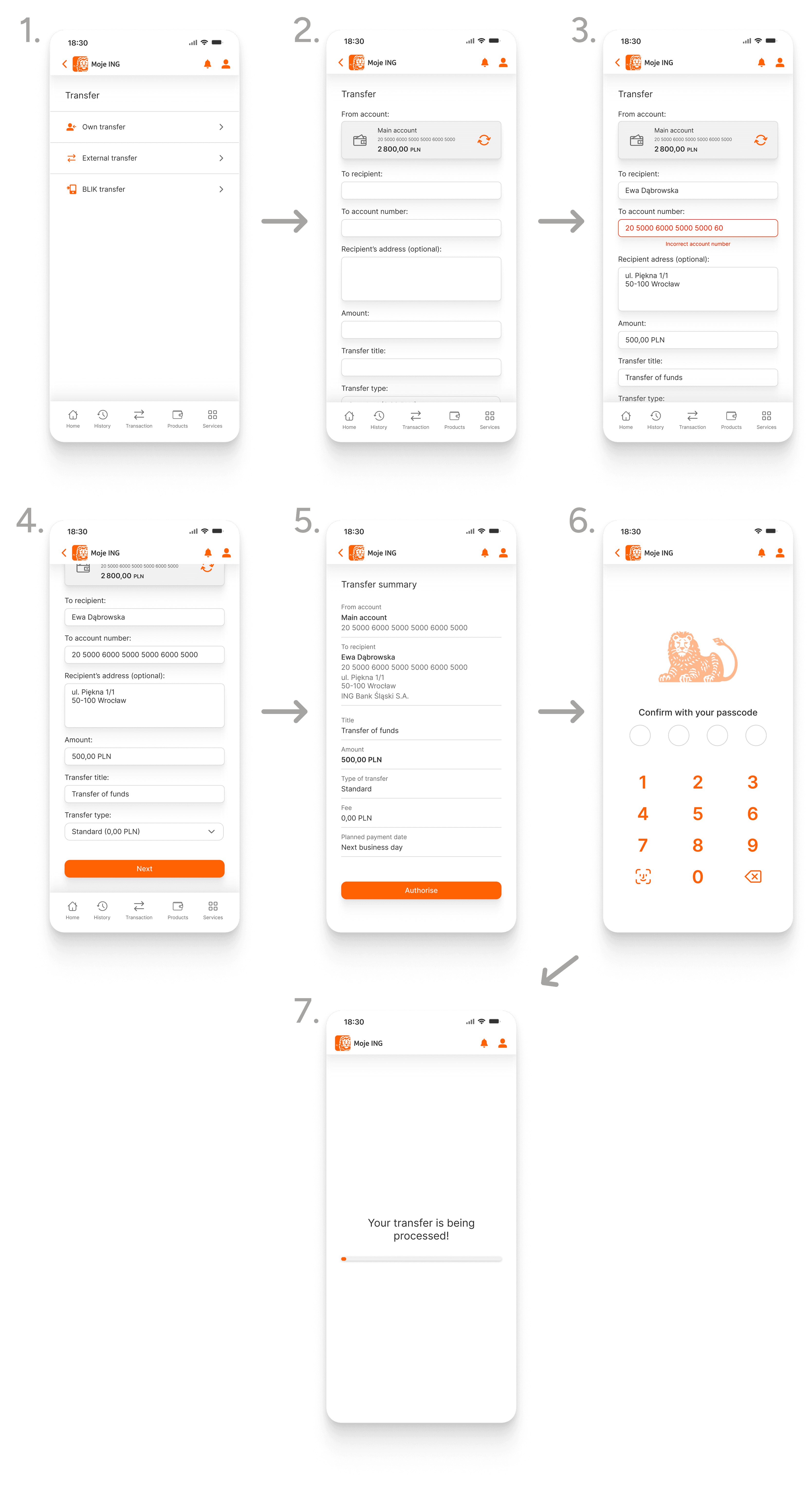
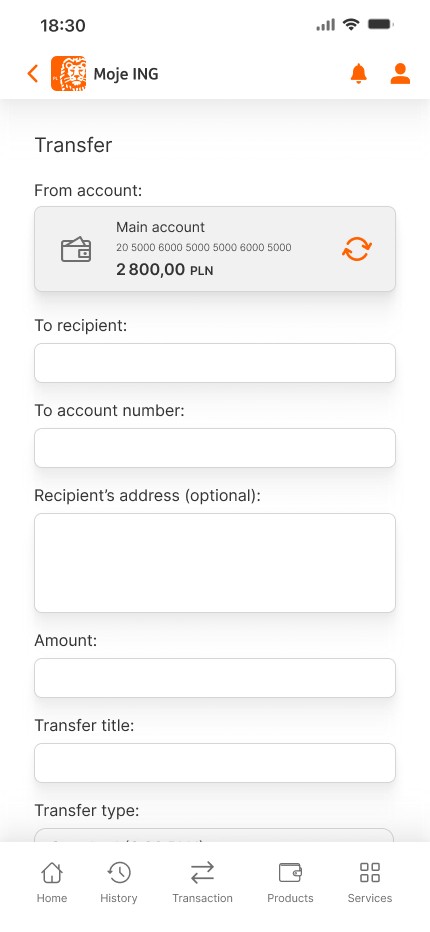
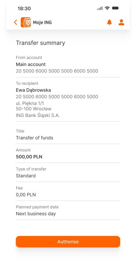
User flow mapping: Defined key user journeys like account overview and money transfers
Defining requirements 🎯
User personas: Based on the research I created two user personas for different types of banking users (Zuzanna and Dawid)
Use cases & user journeys: Mapped how users will interact with the app
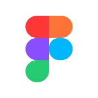
Feature list: Defined the key functions and operations in a banking application
Wireframing 📋
Low-fidelity wireframes: Sketched early wireframes to establish layout and structure
Early usability testing - Validated navigation and workflows before high-fidelity design
UI/UX Design 🚀
High-fidelity mockups: I designed pixel-perfect screens with enhanced UI elements and branding consistency
Microinteractions & Animations: I implemented animations for smoother transitions (button feedback, loading states)
Prototype testing 🕹
Functional testing: I verified that all features function correctly and behave as expected.
Usability testing: I gathered user feedback to refine the design, improve navigation, and resolve usability issues

Age
20
Status
Single
Ocupation
Psychology student
Location
Wrocław, Poland
Tech savy
High
About
Zuzanna is passionate about psychology and plans to study abroad next year. She is also concerned about managing her student loans and looks for ways to optimize her finances.
Goals
Save money for a study abroad program in Italy next year
Motivations
Financial education
Needs
Savings accounts
International transaction account
Frustations
Finding user-friendly tools to manage and grow savings
Complicated banking interfaces

Age
37
Status
Married
Ocupation
Sales manager
Location
Łódź. Poland
Tech savy
Moderate
About
Dawid spends a lot of time traveling for work. He values efficiency and needs a banking app that’s simple and reliable for his daily needs.
Goals
Learn to better manage expenses and have the ability to make transfers from various accounts at any convenient moment.
Motivations
Time-saving tools
Seamless integration
Needs
Quick payments for daily commuting expenses (e.g., transport, groceries).
Ability to easily send money to family members.
Clear and simple app layout for busy schedules.
Frustations
Delays in payment transfers.
Limited mobile banking features for traveling.
Before

After

Before

After
Before

After

Before

After


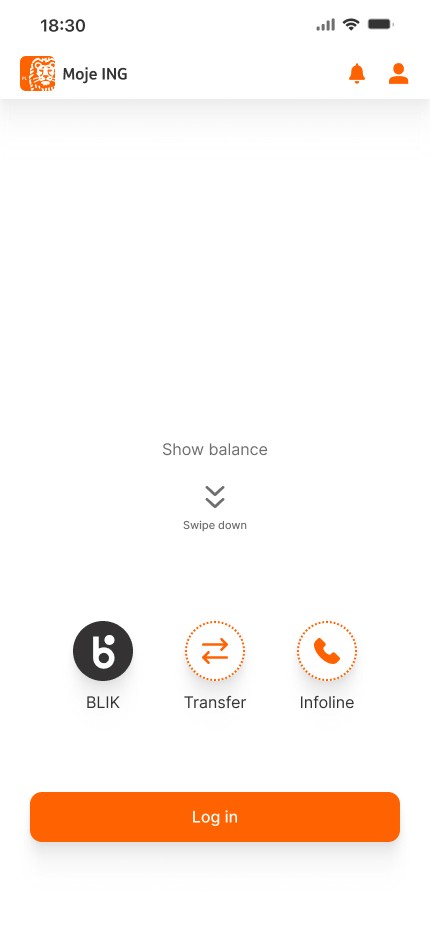
Start/log in


Home


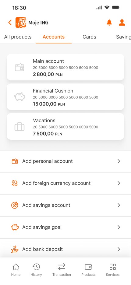
Products
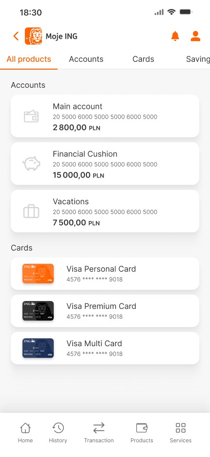

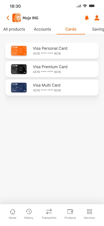
Cards


Savings


Transactions


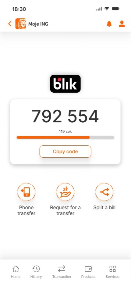
BLIK


Others